Case 01

Design System for Document Co-Pilot at Weav.ai

Enterprise Tool

Introduction
Problem Statement

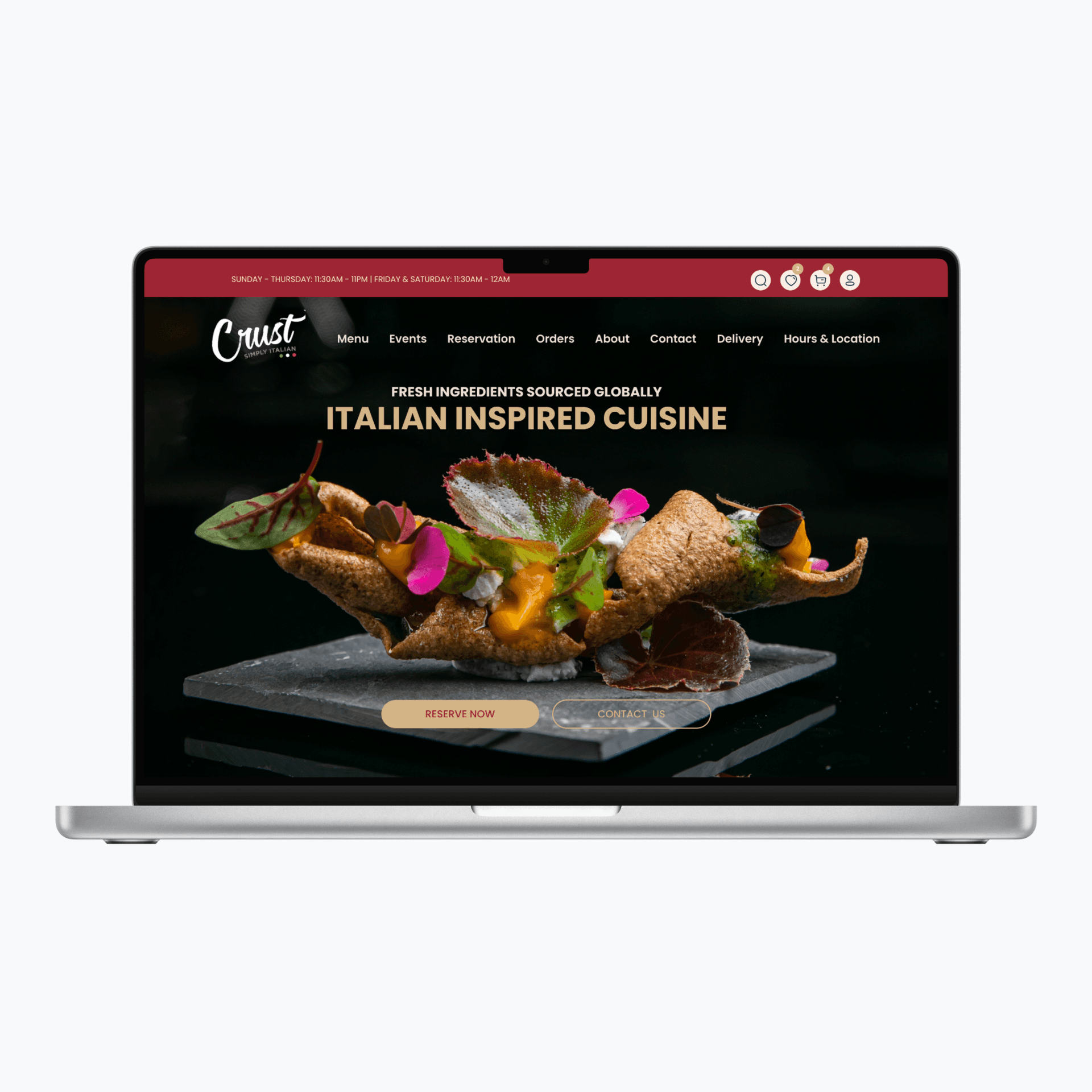
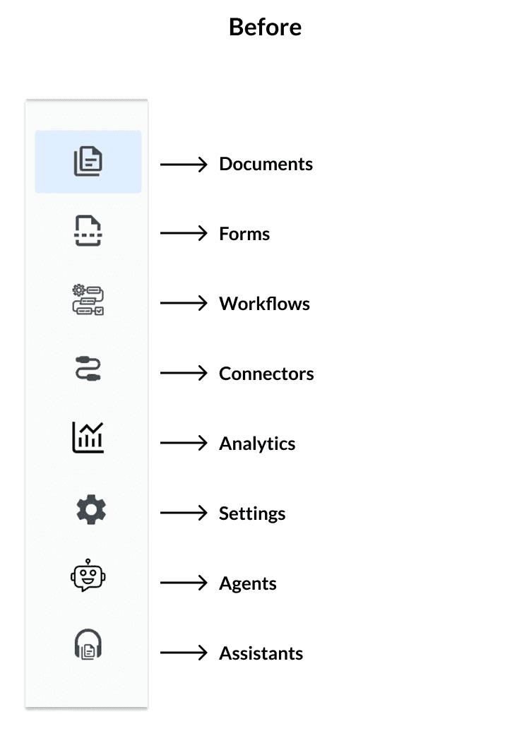
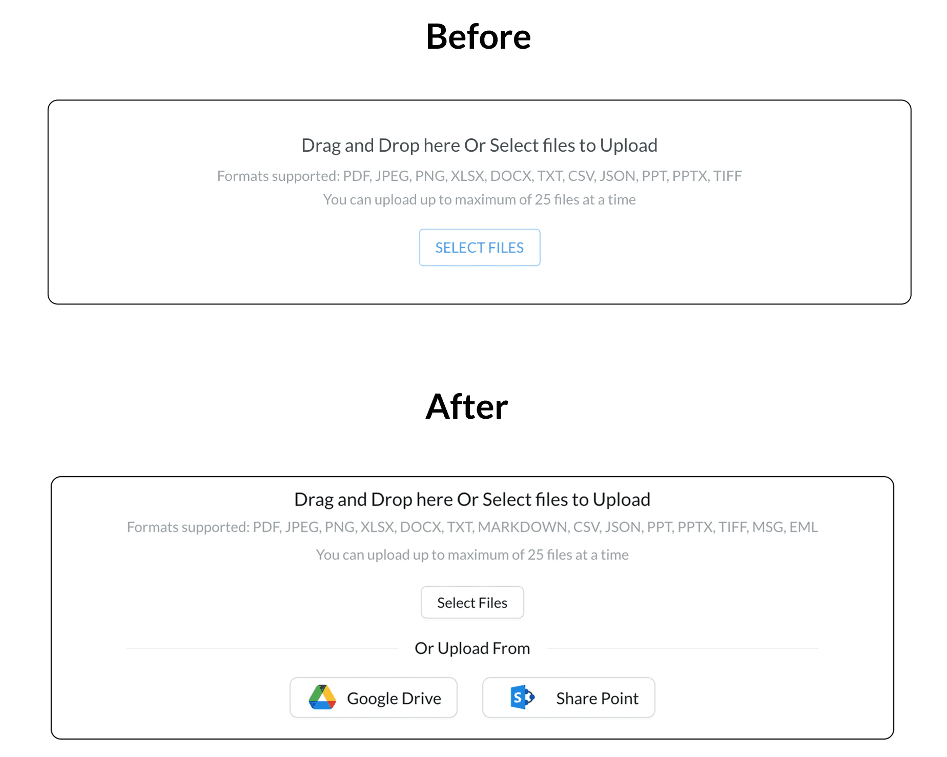
When I joined Weav.ai as a design intern, their Document Co-Pilot tool was growing fast — but the UI wasn’t keeping up. The product relied heavily on table-based layouts and inconsistent components, making it difficult for users to scan, interpret, or interact with key information. Navigation icons were unclear, upload flows were limited, and component styles varied widely across screens.

Objective
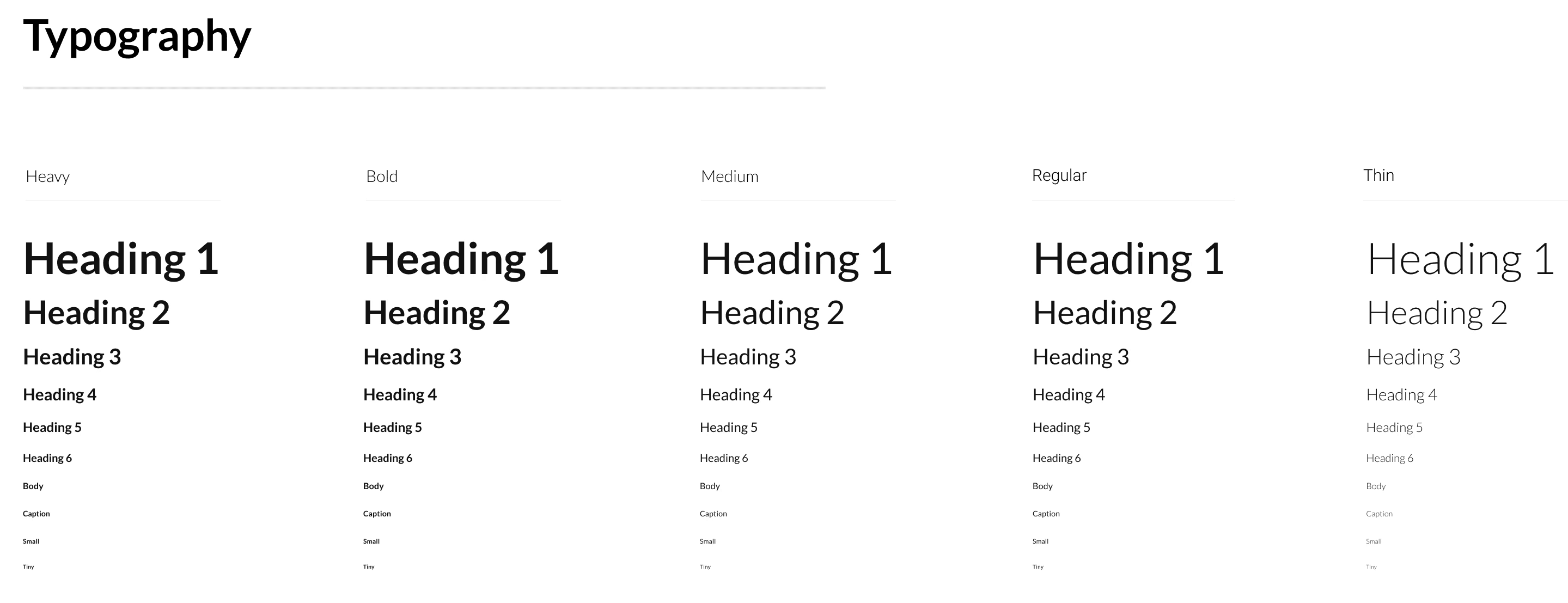
  1. Build a scalable component library in Figma.

  2. Define a set of design tokens (colors, type, spacing).

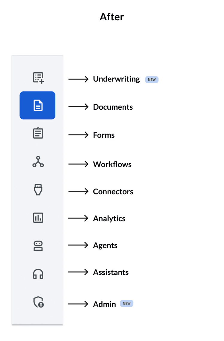
  3. Align the UI system across web tools like File Manager, Upload, and Navigation

  4. Enable smoother handoff and component reusability for dev teams

Tools

Industry

AI Co-Pilot

My Role

Founding UX designer

Duration

May 2024 - August 2024

Client

Weav.ai

Project Overview
Brief Summery

During my 4-month internship at Weav.ai, I took ownership of establishing a lightweight design system to support the fast-growing Document Co-Pilot product — a platform that allows users to search, analyze, and manage enterprise documents using AI.

My role focused on UX research, UI design, and component standardization to improve usability, reduce design-developer friction, and future-proof the platform for scale.

Outcome
Improved Visual Consistency
Faster design- to -development handoff through reusable components
Enhanced clarity and usability for end-users interacting with documents and workflows
What I did?
1. Replacing Tables with Interactive Cards

The original document grid used dense tables to present files — making it hard for users to interpret document status, file types, or metadata at a glance.

To improve this, I:

• Replaced tables with modular document cards

• Introduced clear visual hierarchy (titles, tags, file size, upload time)

• Designed semantic status chips: Ready (green), Failed (red), Processing (blue)

• Created hover and selected states for better accessibility and interaction

This transformation improved readability, made the layout more scannable, and allowed users to take quick action on files.


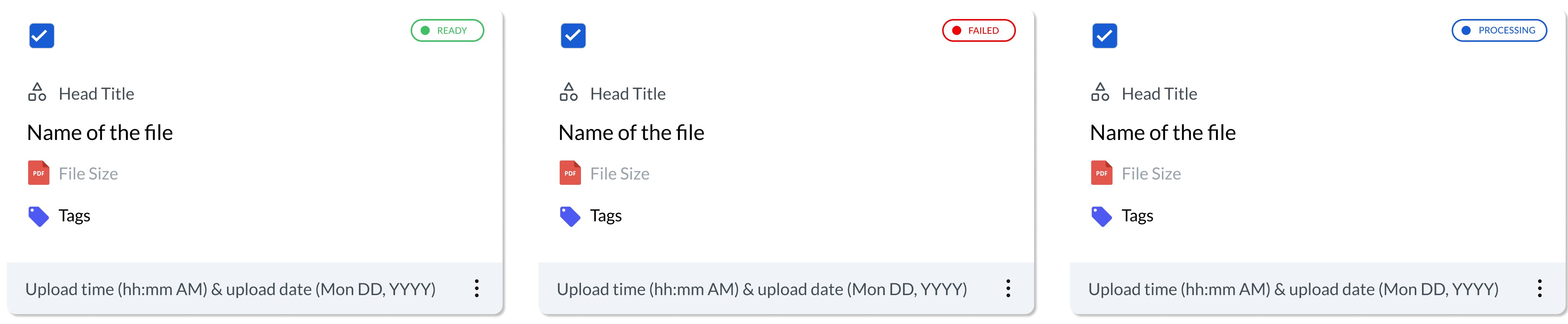
Before UI- Document's Information was in grid format
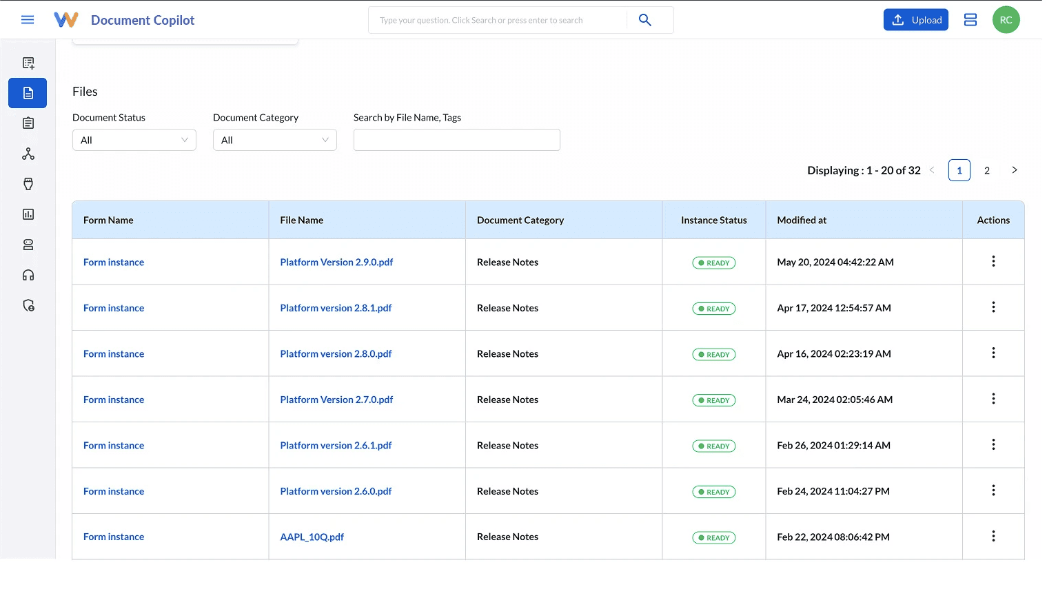
After UI- Document's Information is now displayed in card's format
Static Display View
Hover State with Select option (Interactive Hover)
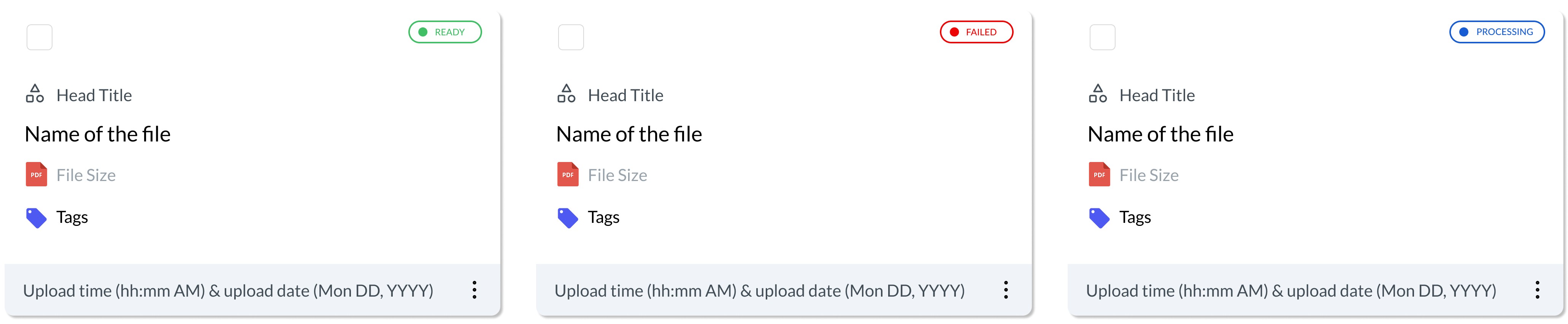
User- Selected State
2. Redesigning the Sidebar Navigation

The old nav bar used generic, mismatched icons — making it hard to interpret what each section meant. Some icons didn’t reflect their labels clearly, while new sections had no dedicated iconography.

I redesigned the nav experience by:

• Introducing a new icon set with clearer metaphors

• Adding “NEW” badges for features like “Admin” and “Underwriting”

• Improving active/hover states for better navigation feedback

3. Expanding Upload Capabilities
Previously, users could only upload files from their local system. To support enterprise workflows, I redesigned the upload module to include:

• Google Drive integration

• SharePoint support

• Enhanced drag & drop interface

• Clear error/disabled states

3. Expanding Upload Capabilities
Previously, users could only upload files from their local system. To support enterprise workflows, I redesigned the upload module to include:

• Google Drive integration

• SharePoint support

• Enhanced drag & drop interface

• Clear error/disabled states

3. Expanding Upload Capabilities
Previously, users could only upload files from their local system. To support enterprise workflows, I redesigned the upload module to include:

• Google Drive integration

• SharePoint support

• Enhanced drag & drop interface

• Clear error/disabled states

4. Building the Core Component Library
I created a Figma component library including:

• Status chips

• Form fields (inputs, dropdowns)

• Action buttons (Primary, Secondary, Disabled)

• File and folder cards

• Pagination and tooltips

All components were built with:

• Variants for states

• Consistent spacing

• Accessible color contrast


5. Logo & Typography Exploration
To ensure brand scalability across Weav.ai’s growing tools, I also created:

• Multiple Weav.ai logo variations (outlined, flat, mono, responsive sizes)

• Extended typography system: beyond Regular/Medium/Bold to include Thin and Heavy

5. Logo & Typography Exploration
To ensure brand scalability across Weav.ai’s growing tools, I also created:

• Multiple Weav.ai logo variations (outlined, flat, mono, responsive sizes)

• Extended typography system: beyond Regular/Medium/Bold to include Thin and Heavy

5. Logo & Typography Exploration
To ensure brand scalability across Weav.ai’s growing tools, I also created:

• Multiple Weav.ai logo variations (outlined, flat, mono, responsive sizes)

• Extended typography system: beyond Regular/Medium/Bold to include Thin and Heavy

Impact

✅ Created 15+ modular components used across 4 key product flows

✅ Reduced repetitive UI work, speeding up iteration by ~30%

✅ Improved visual consistency across the platform

✅ Enabled faster onboarding for future designers and devs

Peer's Feedback

Beyond the outcomes, one of the most rewarding parts of this project was the collaborative spirit. Here’s some feedback I received from my peers.

Aditya Kotwal

Software Developer

I really liked the design system created by Rishabh, It was clear scalable & well documented. Every component felt intentional, & made our design to dev handoff smoother.

Bala Murugan

Technical Lead

Rishabh's design system brought structure and consistency to our UI. His clear documentation and component logic made integration seamless for developers & significantly improved our front- end velocity.

Key Obsesrvations
I learned the value of:

Starting from real product pain points Designing for reuse, not just reuse today — but future expansion Communicating design logic clearly for engineers

I learned the value of:

Starting from real product pain points Designing for reuse, not just reuse today — but future expansion Communicating design logic clearly for engineers

I learned the value of:

Starting from real product pain points Designing for reuse, not just reuse today — but future expansion Communicating design logic clearly for engineers

If I had more time, I would have:

Integrated this system into a live documentation tool like Zeroheight or Storybook Added light/dark theming support Included accessibility annotations from the start

If I had more time, I would have:

Integrated this system into a live documentation tool like Zeroheight or Storybook Added light/dark theming support Included accessibility annotations from the start

If I had more time, I would have:

Integrated this system into a live documentation tool like Zeroheight or Storybook Added light/dark theming support Included accessibility annotations from the start

Select this text to see the highlight effect